Apply your branding in a Snap: Adapting a New Look & Feel to the Design System in just 30 Minutes

Leverage the systemic structure of kickstartDS to effortlessly create a distinctive theme using Style Dictionary and Component Tokens

👉 Briefing 👈

The design we've selected for this exercise is starkly different from the pre-existing set-up, allowing for a clear illustration of how effortlessly the system can be tailored to align with your unique brand and corporate design. This exercise will guide you through the process of transforming the look and feel of the Design System in a matter of minutes.

Adapting the style & design of your brand

A selection of colors and fonts with example text.

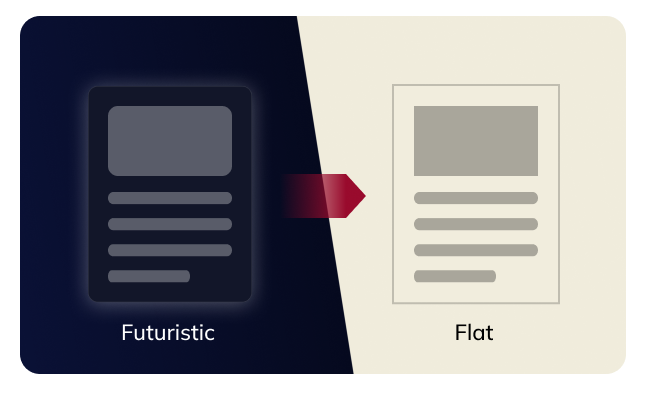
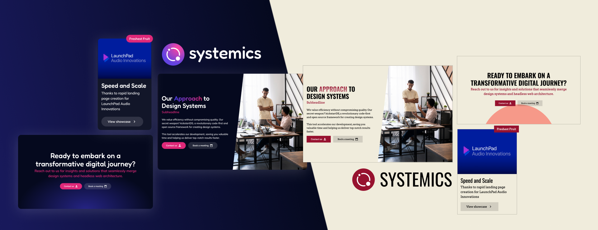
To demonstrate the simplicity of applying a totally different brand, we've selected a design wich heavily differs from the systemics default look'n feel.

We start by selecting a direction for our Design System. In this case, the branding to apply is a flat, paper-inspired design to contrast with the futuristic, gradient-heavy look of Systemics.

The broad identity of the design system will feature:

  • Sharp shapes, avoiding rounded corners
  • Flat colors, avoiding gradients
  • Colorful backgrounds for both light and dark sections

Specific design elements include:

  • A beige tone reminiscent of old unbleached paper
  • A bourbon red that pairs nicely with the muted beige
  • The Oswald font, adding style and excitement to text bodies
  • The Arvo font, reminiscent of typewriter characters, fitting our vintage paper theme

That's all the preparation we need to start branding!

🧑‍🎨 Branding

Once we've sorted out the basic design elements, we can input them into our branding token. This will generate a style dictionary customized to your preferences. It's a handy tool for setting clear design rules.
A graphic illustrating the application of colors in the design system, highlighting background, text, and primary colors.

🎨 Colors

We apply our chosen colors to the appropriate tokens. The vibrant red serves as an excellent primary color, while the beige offers a pleasant background hue. For body text, we use a straightforward black to align with the print aesthetic. On the inverted side, the red works well as a background color. For a primary color on this red background, we modify the beige slightly to achieve a more vibrant yellow. Text in this context is plain white.
A graphic illustrating the application of font styles in the design system, displaying display, copy, interface and mono font styles.

Font Families, Font Sizes & Font Weights

We apply our chosen fonts to the corresponding categories. For "Display," we use the eye-catching "Oswald" font, perfect for large headline-like text. For "Copy," which includes paragraphs and most content, we opt for the typewriter-like "Arvo" font. The "Interface" category, covering elements like buttons and forms, also features the "Arvo" font for consistency. Lastly, "Mono" is used for code snippets, where we utilize "Roboto Mono."

As far as font sizes go, we use large sizes for headlines and standard sizes for copy and interface elements. Font weights are also quite standard, including regular, medium, and bold.

A graphic illustrating the impact of the box-shadow and border-radius token at the hands of a teaser box in the old & new design.

🖼️ Border Radius & Box Shadow

We set the border radius to 0 and the box-shadow blur to 0 for a flat design. This approach creates a clean and straightforward look, eliminating any rounded corners or shadow effects. For example, a card-like element in this theme will have sharp edges and no shadow, giving it a crisp, minimalist appearance. This choice enhances the vintage newspaper aesthetic, maintaining a focus on the content without any distractions.
A graphic showing abstract shapes inside of a browser and some arrows indicating the places the spacing in the design system is applied.

🫷 Spacing

Almost every padding and margin in KickstartDS is based on the spacing scale, making this value a powerful tool to completely transform the feel of a theme. We opted for a more spaced theme to create an open and functional feel.

📙 Style Dictionary application

Once we have our branding set up, we'll have a unique and comprehensive design ready. If it meets your needs, that's great! But if you want to make further adjustments, stick with us as we explore the style dictionary.

🌏 Adjusting global border widths

We want our Design System to feature thick borders. To achieve this, we simply need to increase the default and emphasized border widths by one pixel each. This adjustment particularly affects UI elements such as cards, buttons, and form elements.

💃 Component Token Tweaks

Due to the systemic nature of kickstartDS, there will inevitably be instances where your specific style preferences are not fully achieved by simply applying the style dictionary. This is where component tokens become crucial. These tokens define all the relevant design characteristics of our components, making these characteristics easily accessible even to those who are not experienced in CSS or HTML.

We will dive into some concrete examples to demonstrate how easily you can tweak a component's appearance.

👩‍💻 Transforming Sections

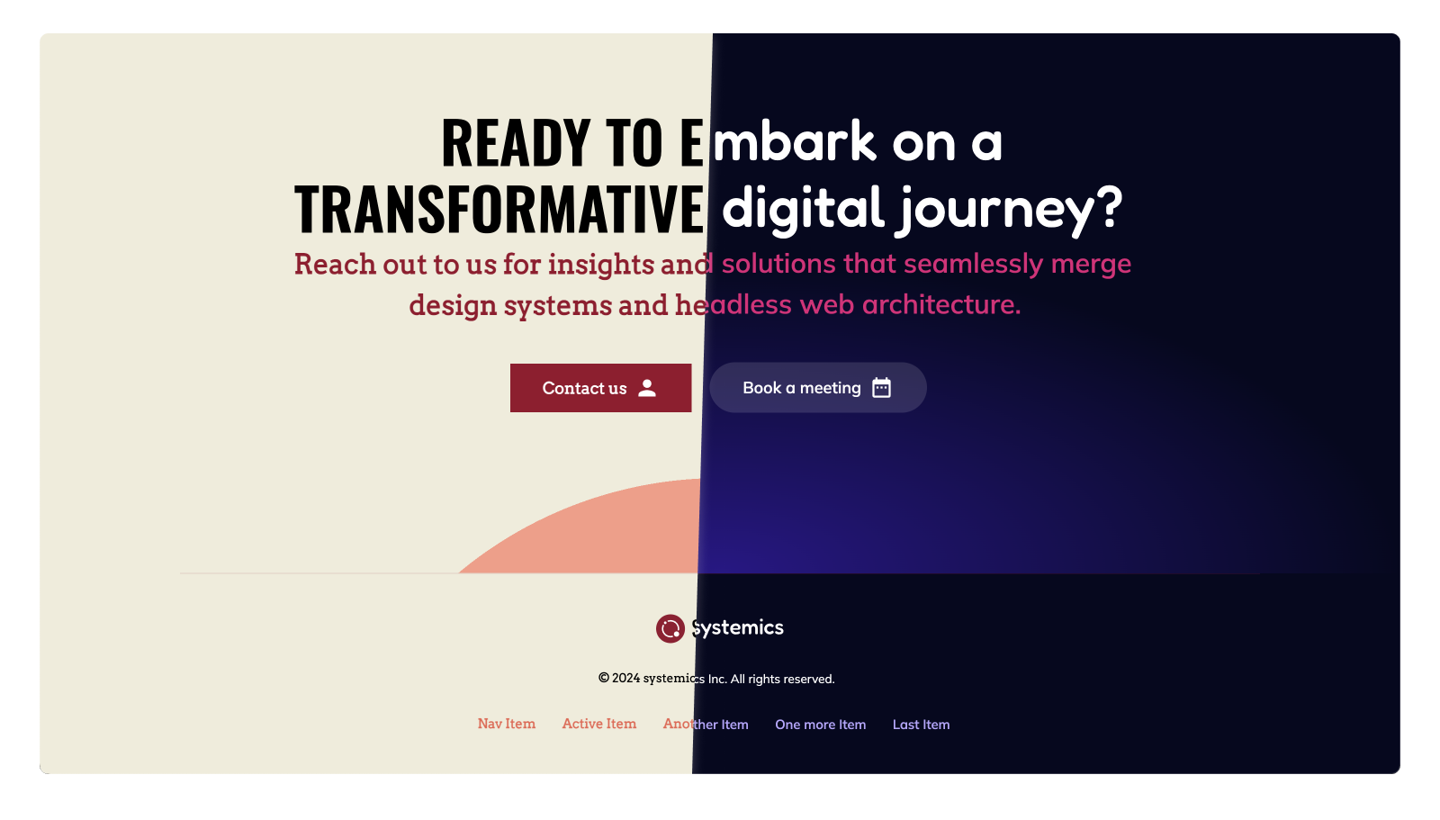
The Section Component in the Design System Agency theme features smooth gradients. Lets make them suitable for our flat design by tweaking the component token.

By simply adjusting the gradient edges and positioning, we can completely transform the appearance of our sections, thereby enhancing the overall aesthetic of our content pages.

🧙 Tweak the buttons

The Design System Agency buttons currently feature a pill-shaped border radius. We want to replace this with the control border radius, which is set to a square shape.

☝️ Conclusion & Next Steps

In this showcase, we've demonstrated how to transform the look and feel of a Design System using style dictionaries and component tokens. From choosing a style to fine-tuning individual elements, the process is straightforward and flexible, allowing for a highly customized and cohesive design.

The power of kickstartDS lies in its ability to adapt to your unique vision while maintaining consistency across all components. Whether you're looking to make small adjustments or complete overhauls, the tools and techniques we've covered will help you achieve your design goals with ease.

We encourage you to explore further, experiment with different styles, and make the Design System truly your own. The possibilities are endless, and the results can be transformative.

Thank you for joining us on this quick walkthrough on how to theme a design system based on kickstartDS.

👋 Happy designing!

Many thanks to Freepik. All website comps by Freepik.